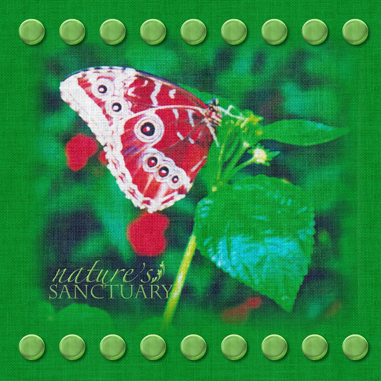
Photo by Dale Massey Photography in Asheville, NC.
For this page I used a floral paper from the Bright Blooms collection. After making it my background I unlocked it on the element ribbon so I could make changes. I then went to the Color tab and selected the Black & White option to remove all the color. (My inspiration for this page came from my friend Linda W. who used a photo of a bridal boquet to make the background.) I then went to the cut and fill tab and chose the Ellipse tool and made an oval in the size of the cutout I wanted, then cut it out. I took the oval I had just cut out and enlarged it to make it larger than the opening, then once again used the Ellipse cutter to cut out the center of the oval, leaving a fairly wide outline. I then copied and pasted this outline and made the copy a little larger than the first one. Once you have them arranged you will need to copy and paste both oval outlines and your background. I used a gradient to fill in all 3 o these pieces, I used the color sample tool to get a light gray from the paper. You can play around with which gradient to use, (I personally think it works best with the "light stripe" going vertically or horizontally through it.) You then lower the opacity on the copies filled with a gradient to a pretty low number. I then grouped together the original and gradient copy for all 3 pieces. The next thing I did is click on the arrow under shadow, (after highlighting one of the oval outlines) and added heavy shadow facing all four corners, (remember you will have to flatten the element each time in order to add shadow again. I repeated these steps with the second oval, (or you could wait until this point to copy and paste your oval outline and enlarge it.) After adding shadow probably 2 times in each of the 4 directions, I went to the Format tab and chose the Soften Edge Filter. I moved the slider up and applied it 2 or 3 times until I like the look, then went back and added shadow in each direction to my two "frames" again until I got the look I wanted, you may have to play around with this, just use that undo button! The gradient layer on top combined with the shadow give the frames a rounded, 3D appearance.
In order to use the template, you will probably want to turn off the "eyeball" on the top layers and start at the bottom filling in each layer. You may have to change the color of your gradient layers accordingly. Everything is cut out and ready, but you will need to follow the above instructions to get the effect you see in the example. The embellishments I added in the corners of the page I did are from the Tie The Knot collection.
Please let me know if you have any questions, or just like the page. Leave me a comment or e-mail me at tgillespie67@aol.com, put CM in the subject line please. I would love for you to check out my web site, www.mycmsite.com/tammygillespie, or my Facebook group, Tamela's Scrapbooking Divas. I have a number of pages posted there under the pictures from myself and others. Hopefully you can find some inspiration there.
If you are unfamiliar with how to download and save a template, the instructions are included with each of my older posts for templates, I will not repeat it again on this one.
If you like these templates please click on share and post a link to Facebook, Twitter, or any other site you would like to. Don't forget to give your friends the address, http://www.scrapperdiva.blogspot.com/ so they can get the templates and freebies too.
I hope you enjoy this one and have a great weekend!
Tammy
62e74dd6-b34b-40ad-bed3-2124ecfd43fa.page


Bugs me that the reactions are so tame, I'd say wonderful layout, beautiful page, & creative design. Nice work *U* Kathleen
ReplyDeleteThank you Kathleen, that is a lovely thing to say. I'm glad you enjoyed it! I can't take all the credit for the design, I did take inspiration from a friend who is a consultant!
ReplyDeleteawesome thank you
ReplyDeletefrom Sue-Ellen
Thank you Sue-Ellen!
ReplyDelete